How to Style Raster Layers
Access Styling Panel
- Click on a raster layer in the layers panel to select it
- The styling panel opens on the side with all raster customization options
- Use the header buttons to zoom to the layer, access layer settings (rename, remove, etc.), or unselect the layer
Available Styling Sections
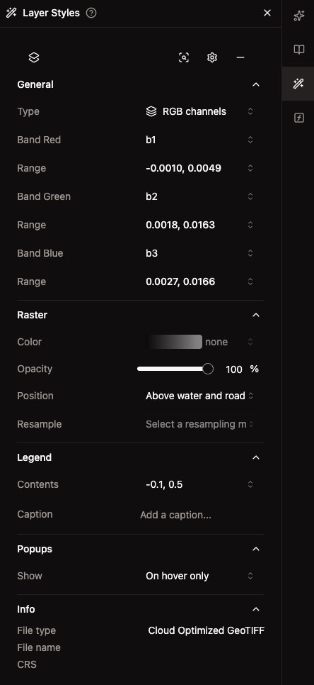
General Section
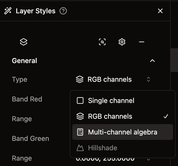
- Type: Choose visualization method — Single Channel, RGB Channels, Raster Algebra, or Hillshade
- Band Selection: Select which bands to display (options change based on type)
- Range: Set data range for each band using absolute values or percentiles
Raster Section
- Color Mode (Single Channel only): Choose between Named Colormap, Classify, or Unique Values
- Color: Select a color map from grouped presets, or configure custom classification stops
- Clip (Google Earth Engine layers only): Clip the raster to a polygon vector layer on the map
- Opacity: Adjust layer transparency (0–100%) with a slider and numeric input
- Position: Control layer stacking order
- Resample: Select resampling method for zoom levels
Legend Section
- Show: Toggle legend visibility on or off
- Caption: Add descriptive text for the layer legend
Popups Section
- Show: Configure when popup information appears (Hover Only)
Info Section
- File type: Shows raster format — Cloud Optimized GeoTIFF or GeoTIFF (with a warning if not cloud-optimized)
- File name: Display file name
- CRS: Show coordinate reference system
Visualization Types
Single Channel
- Display one band at a time
- Choose band: Select from any available band in the dataset
- Set range: Adjust min/max values for the selected band
- Apply color mode: Use Named Colormaps, Classify, or Unique Values
RGB Channels
Available when the raster has more than one band.- Display three bands mapped to red, green, and blue channels
- Band Red / Green / Blue: Select which band maps to each channel
- Individual ranges: Set min/max or percentile values independently for each channel
Raster Algebra
Available for non-GEE rasters with more than one band. Compute spectral indices from band math.- Select an expression: Choose from built-in spectral indices
- Map bands: Assign which dataset bands correspond to each variable in the formula
- Set range: Adjust display range for the computed result
Built-in Spectral Indices
Hillshade
- Select a band for terrain shading (currently in preview)
Band Range Adjustment
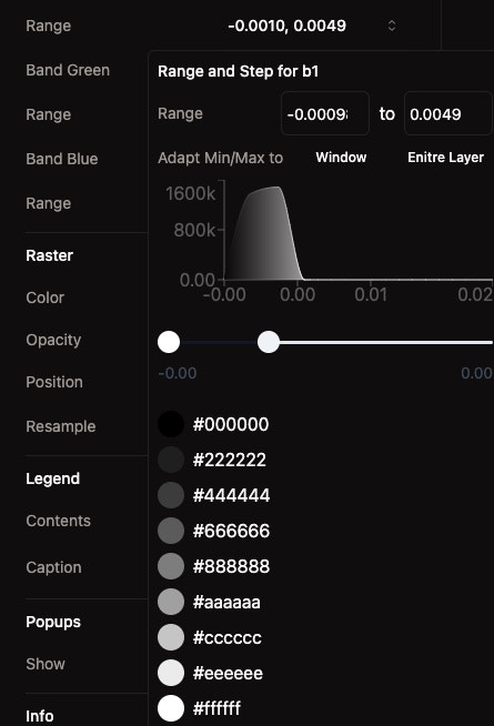
Range Mode
- Absolute: Set explicit min and max values for the band
- Percentile: Set a low and high percentile (e.g., p2–p98) to clip outliers automatically
Adjust Min/Max Values
- Open the range popover by clicking the range display
- Choose a mode — Absolute or Percentile
- Enter values directly or drag the histogram sliders to set the range
- See real-time updates on the map
Adapt Min/Max To
- Window: Recalculate statistics based on the current map viewport
- Entire Layer: Reset to the full data range across the entire dataset
Histogram Display
- Data distribution: See how pixel values are spread across the band
- Draggable range sliders: Adjust min/max directly on the histogram
- Color gradient preview: The histogram reflects the currently applied color map
Color Modes
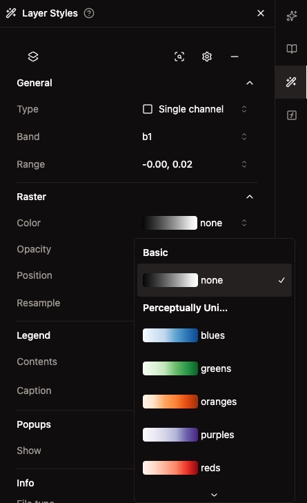
Named Colormap
Select from a library of predefined color maps, organized by category:
Each color map shows a gradient preview in the dropdown so you can see the colors before applying.
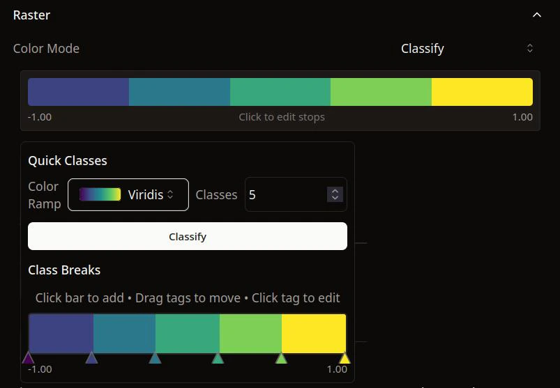
Classify
Group pixel values into discrete classes with custom color stops.- Preset ramp: Choose a starting color ramp
- Number of classes: Set how many bins to divide the data into (default: 5)
- Apply: Generate evenly spaced class breaks from the preset
- Edit individual stops: Adjust break values and colors for each class
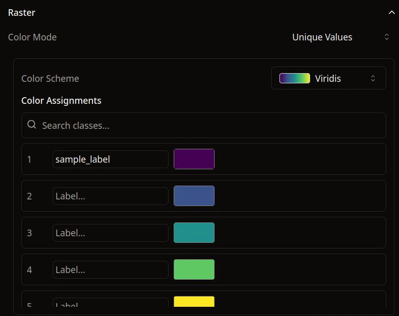
Unique Values
Available when all pixel values in the band are integers (up to 100 unique values).- Preset ramp: Apply a color ramp across all unique values
- Edit individual colors: Click any color swatch to customize
- Labels: Add descriptive labels to each unique value for the legend
Resampling Methods
Control how pixel values are interpolated when zooming. Available methods:- Nearest: No interpolation, preserves original values
- Bilinear: Linear interpolation between 4 nearest pixels
- Cubic: Cubic interpolation for smoother results
- Cubic Spline: Spline-based cubic interpolation
- Lanczos: High-quality resampling with Lanczos windowing
- Average: Average of contributing pixels
- Mode: Most common value among contributing pixels
- Gauss: Gaussian-weighted interpolation
- RMS: Root mean square of contributing pixels
Auto-Save Feature
All styling changes are automatically saved for future sessions:- Settings persist when you close and reopen the map
- No manual saving required
- Consistent appearance across sessions
- Team collaboration benefits from saved settings
Best Practices
Choose Appropriate Visualization
- Single Channel: For analyzing individual bands with color mapping
- RGB Channels: For natural color or false color composites
- Raster Algebra: For computing spectral indices like NDVI, NDWI, or custom band math
Set Optimal Ranges
- Use percentile mode (e.g., p2–p98) to handle outliers without manual tuning
- Use the histogram to understand data distribution before setting ranges
- Adapt to Window to focus on the area you’re currently viewing
Select Suitable Color Modes
- Named Colormap: Best for continuous data — choose sequential for one-directional data (elevation, temperature) or diverging for data with a meaningful midpoint
- Classify: Best for categorizing continuous data into meaningful groups
- Unique Values: Best for categorical/integer rasters like land cover or classification results
Next Steps
- Add More Raster Layers: Combine multiple raster datasets
- Create Composites: Build custom band combinations with Raster Algebra
- Publish Your Map: Share your styled raster layers